


Palette
When thinking of automotive interfaces, you would probably think about something that looks smooth and soft. However, there could be a need for bold designs for the user group that shows strong attitudes.
Role / User Interface, Interaction Designs
Time / 2020, 3 weeks
Contributor / DongNan

I have always wanted to jump out of the existing framework to do a different set of interface designs. In the field of smart automotive interface designs, modern styles design works are rare to see. Often we usually see some styles with rounded corners to meet the mainstream aesthetics. In this project, I decided to use a common interface structure and adjust the visual style to a rare color collision block style. While this set may not seem to be that different, it's possible to see influences from other pieces/products as well. I hope to break the existing formats in the design.

The overall tone adopts the dark mode, which can be more integrated with the interior of the car. On the basis of the dark color, three contrasting colors are added to make the interface less monotonous and increase the uniqueness.

It is very unsafe to have too much interaction while driving. Therefore, the first consideration in the interactive layout design is how to operate more conveniently, and all-important operations must be placed within the driver's reach.
And the closer you are to the driver, the less difficult it is to operate and the safer it is.
In the design, all high-frequency functions / important information are arranged as close to the user as possible.
Generally speaking, the key operation hot area is concentrated on the driver's side (left side).

Click on the music album cover to access the music player page.
The home page hosts two of the most frequently used applications in the operating system: navigation and music. Among them, navigation accounts for the largest proportion. The design of the music module has deliberately removed the music name and singer information, in order to reduce information overload and reduce distraction. The black toolbar at the bottom carries the highest frequency car control content, including a launcher, music play functions, and air conditioning, allowing drivers to find the most commonly used functions instantly.

App icon designs adopt a minimalistic and sharp style. With the minimum requirements of ensuring the recognition rate, the app design echoes with the angular designs of the overall interface. After the app is opened, users can use hand gestures as well as physical buttons to exit. When the launcher appears, a line of text will appear above the icon, and the content of the text will be updated every day, in order to give the daily travel full of positive energy, and full of humanistic care.


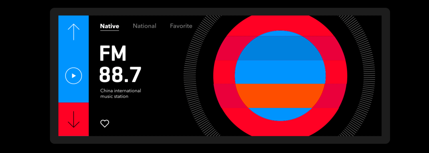
Using graphical transitions to show interaction: In the radio section, I want to adapt circular designs to showcase knob designs.

Operations while driving are usually dangerous. Therefore, the music home page only has one play/resume button: the user has no choice but to connect to the music player via Bluetooth, or to a mobile phone. Of course, in today's increasingly easy-to-use voice interactive programming, it is safer and more reasonable to use voice to control music playback.

At the same time make the touch area more spacious, making the touch safer while driving, and making full use of the beauty of the album cover.
The cover on the right almost fills half the screen, making driving less monotonous.
The large buttons make it easier to identify the operation.

Click the fan icon in the middle at the bottom to pop up the air conditioning control page. Click the fan icon again to close the air conditioner control page. All operations will be set on the driver's side. The picture on the right shows that in addition to showing the wind direction status of the air conditioner, you can also manually drag to adjust the wind direction.
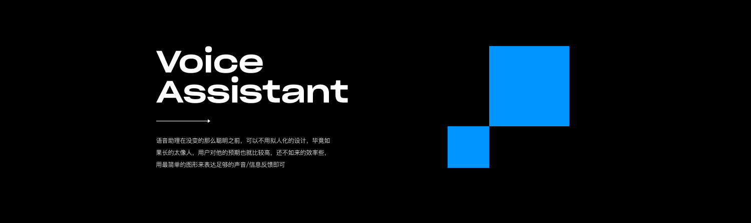
Until a voice assistant becomes smart enough, a more abstract design can be chosen: if the voice assistant is human-like enough, users' expectations for the assistant will increase. So I decided to use simple graphics to show the needed voice and information feedback to improve communication efficiency.


